Potluck
Art Exhibition
In collaboration with Hannah L.C Fine.
Artist Statement:
“Potluck” is defined as whatever is offered or available in given circumstances or at a given time. In this collaboration, we experimented with the examination of food as medium and food as subject. Using over 40 readily available natural ingredients throughout the exhibition, perceptions of frequently consumed food items become altered and highlighted. We used the skills and similarities found within our practices to unite ingredients that have meaningful connections to us personally either through our relationship and familial backgrounds or through visual impact. The works created play off one another in an evolving series by combining an intuitive approach with digital and physical manipulation of materials to create curiosity.
Objective:
Conceptualize a shared body of work and design a cohesive branding system for a collaborative art exhibition between myself and Hannah LC. Fine.
Solution:
I created a brand that accompanies the exhibition and draws subtle references from the artworks through color, material, and form. The color palette was referenced from sheets of pink insulation foam, used throughout the gallery and in the piece Knife Cut II. The typefaces were chosen for their quirky and elegant features that would exemplify our intentions of a creating approachable work inspired by fine dining and food. The print materials were printed on translucent vellum to draw inspiration from the unifying theme of transparency within the works materials and visual concepts.
Keywords:
Brand System, Art Direction, Art Making, Exhibition Layout, Spatial Design, User-Experience
Ambrosia (I, II, III)
22.5” x 31.75”
composed ingredient scans on digital print
Blanch (I, II, III)
9” x 13”
ingredients, resin
Mise en Place
food powder, test tubes,, acrylic, steel, vellum
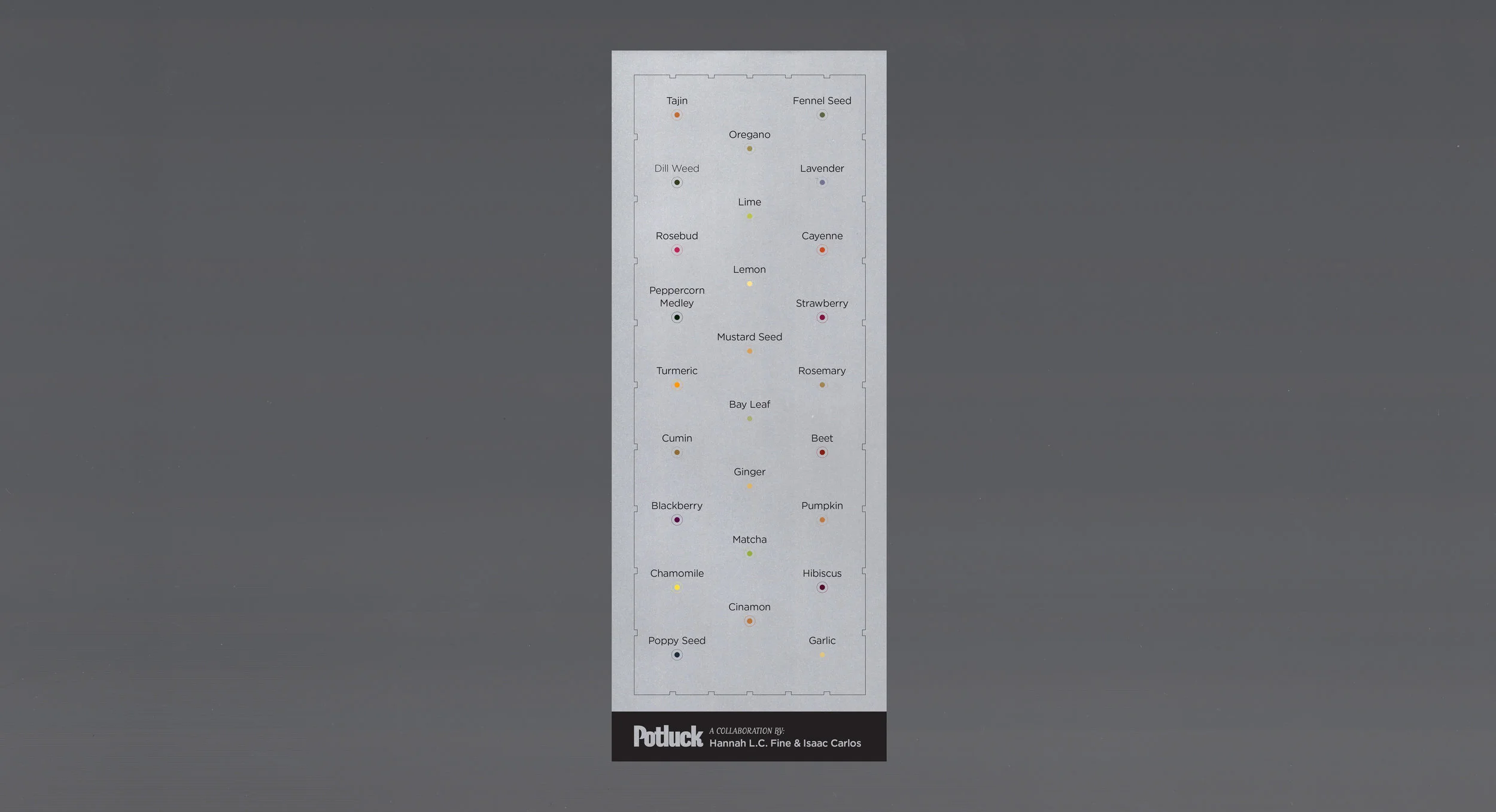
The printed material on the right is a visual guide to the piece Mise En Place.


